Which Data Visualisation Is Best?
Data visualisation is essential for everyone, whether you’re part of a business or a member of the wider public. The main purpose of visualisation is to make information stand out clearly and to present data in a way that’s easy for everyone to understand. It’s about visual storytelling, and it should be accessible to all—not just data scientists or those with a mathematical background or expertise in big data. This is the real power of data visualisation. By transforming complex data into clear visuals, we make it easier for anyone to grasp insights and make informed decisions. From managers needing to interpret performance information to the general public understanding trends in news reports, visualisation bridges the gap between raw numbers and meaningful information. It helps put data science results within everyone’s reach. So what type of data visualisation is best?
In this blog, we’ll explore various types of data visualisation and their ideal use cases. From bar charts to scatter plots, each method brings its own strengths depending on the type of data and the story you want to tell.
We’ll also look at key considerations for choosing the right visualisation to ensure your message is communicated as clearly and effectively as possible through powerful visual storytelling.
Why you need data visualisation for a business
Data visualisation is essential for businesses to convert raw data into actionable insight. With large data sets, it’s difficult to spot trends or make informed decisions without clear visual representation. Using the right data visualisation technique, businesses can transform complex data into insights that drive decisions and improve performance. This transforms raw data into meaningful business analytics and enhance overall business performance.
What are the best ways to visualise data? Overview
- Area chart: uses shaded areas beneath a line to represent cumulative values over time, making it ideal for showing trends and the magnitude of change across multiple data series.
- Bar chart: ideal for comparing distinct categories of data into an easy to grasp graph.
- Column chart: uses vertical bars to compare values across categories, making it ideal for visualising data changes over time or across fewer categories.
- Funnel chart: ideal for visualising processes- particularly in marketing and sales- with multiple stages, highlighting drop-offs or conversions.
- Gantt chart: effective for visualising project timelines, tracking task durations and dependencies, and ensuring deadlines are met.
- Heat map: great for showing data density or patterns across geographical or other spatial representations.
- Line chart: useful for showing trends over time.
- Pie chart: suitable for illustrating proportions within a whole.
- Scatter plot: effective for revealing correlations between variables.
- Stacked bar chart: displays data in segments within a single bar, allowing for comparison of both the total value and the individual components across categories.




How to choose the right data visualisation for your data type
The type of data you’re working with directly impacts which visualisation will work best. Understanding these distinctions ensures every data point is clearly communicated and easy to interpret. Here’s a breakdown of common data types and the visualisations suited to them:
Categorical data
For data divided into distinct categories, bar charts are ideal. They allow easy comparison between different groups, helping highlight variations or patterns. If you want to show proportions within a whole, a pie chart can also be useful, although it’s best kept for simple datasets.
Time-series data
When displaying changes over time, line charts are your go-to tool. They effectively track trends, peaks, and dips across a timeline, making it easy to identify patterns or significant shifts in your data.
Proportional data
If you need to show how parts contribute to a total, pie charts or stacked bar charts work well. These are particularly helpful for illustrating percentages within a larger dataset. Stacked bar charts also allow for easy comparison between categories over time.
Relational data
Scatter plots are excellent when you want to explore relationships between two variables. They help reveal correlations, clusters, or outliers, providing a clear picture of how one variable impacts another.
What common mistakes should you avoid when choosing a data visualisation
Even the right visualisation can fail if not executed carefully. Here are some common mistakes to watch out for:
Overcomplicating the visualisation
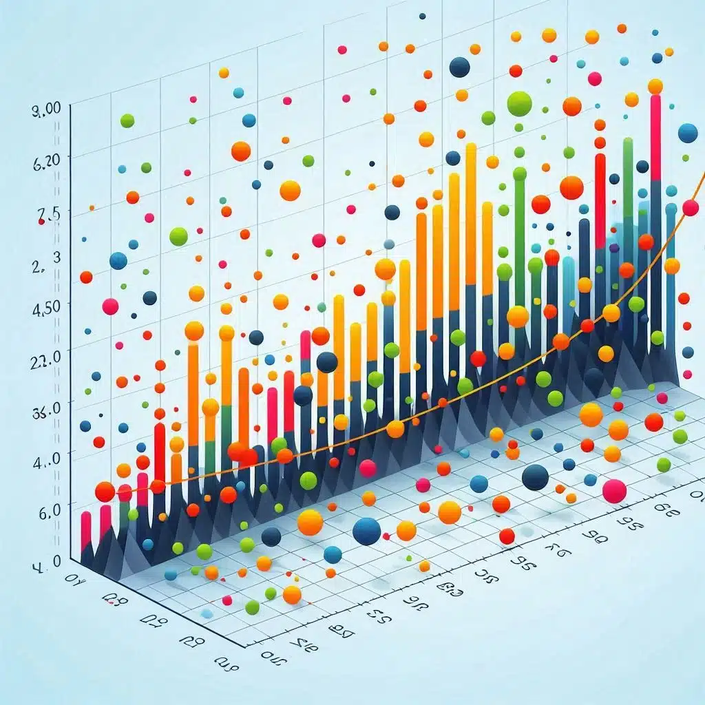
One of the most frequent mistakes is trying to do too much. Adding too many data points, elements, or types of charts in one visualisation can overwhelm the audience. Aim for simplicity. A clear, focused chart will communicate your point more effectively than a complex one. Avoid unnecessary decorative elements, such as 3D effects or excessive shading, which can detract from the data’s message.
Using the wrong scale
Scaling is crucial to accurate data representation. If your chart’s axes are improperly scaled, it can mislead the audience. For instance, manipulating the scale to exaggerate small differences between data points can distort the true picture. Always ensure your axes start from a logical point and represent the full range of the data. Consistency in scaling across multiple charts is also key to comparison.
Poor colour choices
Colours can enhance a visualisation, but too many or poorly chosen colours can confuse viewers. Stick to a logical colour scheme that matches the data. For example, using a gradient can be useful for continuous data, but bold contrasting colours may be better for categorical comparisons. Be mindful of colour-blind friendly palettes and avoid excessive use of bright, clashing colours.
Misrepresenting the data
It’s important to choose the right chart type for your data. A pie chart, for example, is not suitable for datasets with many categories. Similarly, using a line chart for unrelated categories can mislead. Select the visualisation that best suits the nature of your data and ensures accuracy.
Best practices for effective data visualisation
To create clear and engaging visualisations, following best practices is essential. These guidelines will help ensure that your visuals communicate the intended insights effectively.
Keep it simple
The simpler your visualisation, the easier it is to understand. Avoid unnecessary decorative elements, such as 3D effects or excessive use of gradients. These can distract from the core data. Focus on displaying the essential information. Ask yourself if each element adds value—if not, remove it. A clear, minimalist chart is often more impactful than a visually crowded one.
Use appropriate chart types
Selecting the right chart type for your data is crucial. For example, bar charts work well for comparing categories, while line charts are best for showing trends over time. Scatter plots are excellent for exploring relationships between variables. Resist the temptation to use a flashy chart type if it doesn’t fit the data. Always prioritise clarity over visual appeal.
Label clearly and concisely
Good labelling helps the audience understand your visualisation quickly. Axes should always be labelled with the relevant units of measurement. Use concise, descriptive titles that explain what the chart shows. Avoid cluttering the visual with too much text, but do include key data points and annotations where they add clarity. Legends should also be easy to read and interpret.
Be consistent with formatting
Consistency in formatting helps your visualisations look professional and makes them easier to read. Use the same font style and size throughout your charts. Ensure consistent scaling and colour schemes, especially when comparing multiple charts. This avoids confusing the viewer and helps focus attention on the data rather than the design.
What are the best tools for creating effective data visualisations?
Choosing the right tool can make data visualisation easier and more efficient. Below are some popular tools for creating clear and engaging visualisations, ranging from beginner-friendly options to more advanced software.
Microsoft Excel and Google Sheets
Excel and Google Sheets are accessible options for creating basic charts and graphs. Both platforms allow users to generate bar charts, line graphs, pie charts, and scatter plots with minimal effort. They are ideal for small datasets and quick visualisations. However, these tools may not offer the advanced features needed for more complex or interactive visualisations.
Tableau
Tableau is widely used for creating advanced and interactive data visualisations. It offers robust features for handling large datasets and performing complex analysis. Tableau’s user interface is intuitive, but it requires some time to master. It is an excellent option for business intelligence and in-depth reporting. Tableau’s ability to connect to multiple data sources makes it highly versatile.
Microsoft Power BI
Power BI is another popular tool, especially for business users. It allows you to create dynamic dashboards and reports, integrating seamlessly with Microsoft Excel and other Office products. Power BI is user-friendly and offers advanced visualisation features for reporting and analytics. It’s a great tool for creating interactive dashboards that update automatically as new data becomes available.
Qlik
Qlik is a robust platform for data analytics and visualisation, allowing for highly interactive dashboards. It uses an associative engine that helps users discover hidden insights and relationships in their data. Qlik is particularly strong for users needing to perform exploratory analysis on large datasets. It offers a user-friendly interface and supports complex visualisations, making it popular for data-heavy businesses.
Google Data Studio
Google Data Studio is a free tool for creating interactive dashboards and reports. It integrates smoothly with Google products such as Google Analytics, Sheets, and Ads. It’s great for teams that need to collaborate on projects or present dynamic, real-time data. While it lacks the advanced features of tools like Tableau, it’s ideal for smaller datasets and quick visualisation needs.
How to choose the right data visualisation tool for your needs
Choosing the right data visualisation tool depends on several factors, including your budget, experience, and the complexity of your data. Here are key considerations to guide your decision:
Budget
Your budget plays a significant role in choosing the right tool. If you’re working with limited funds, free tools like Google Sheets and Google Data Studio are excellent options for basic visualisations. However, for more advanced features like interactive dashboards and larger datasets, tools like Tableau, Power BI, and Qlik may require an investment. These platforms offer scalable pricing plans, so it’s worth considering how much you’re willing to spend versus the functionality you need.
Ease of use
For beginners or users needing simple visualisations, Microsoft Excel or Google Sheets are user-friendly and familiar to most people. These tools require minimal training and can quickly generate basic charts. If you need more advanced features, tools like Tableau and Qlik offer greater flexibility but may have steeper learning curves. They are ideal for users comfortable with complex data manipulation or those who have experience in data analytics.
Complexity of data
The complexity and size of your data will dictate which tool is best suited for your needs. If your data is large or you need in-depth analysis, Tableau, Power BI, or Qlik are excellent choices. They handle vast datasets efficiently and provide a wide range of visualisation options. On the other hand, if you’re working with smaller datasets or need quick visualisations, Excel or Google Data Studio should suffice.
Integration with other tools
If you rely on other software for your data analysis or reporting, consider how well the visualisation tool integrates with those platforms. For example, Power BI integrates seamlessly with Microsoft Office products, while Google Data Studio connects easily to Google Analytics, Sheets, and Ads. The ability to pull data from other systems can save time and effort.
Collaboration needs
If you need to collaborate with others or share reports easily, consider tools that support real-time collaboration. Google Data Studio and Power BI’s online versions allow multiple users to access and work on the same reports. This is especially useful for teams working remotely or needing to share updates regularly.
How can Albatrosa help you choose the right data tools for your business?
At Albatrosa, we specialise in helping businesses select the most effective data visualisation and analytics tools tailored to their needs. Since 2009, we’ve been working with organisations of all sizes, from large banks to consultancies and SMEs, ensuring they get the best results without overshooting their budget. Our expertise means we can recommend solutions that fit your unique requirements, whether you need to clean up your data source, use simple tools or advanced platforms for complex data analysis. Contact us today, and let our experts guide you to the right tools that will maximise your business insights. For inspiration, read our case studies here.

