Should You Go on a Data Visualisation and Storytelling Course?
In this day and age, the ability to present complex information clearly and effectively is more valuable than ever. Whether you work in business, academia, or government, you’re likely to encounter situations where data needs to be communicated to an audience that might not share your expertise. This is where data visualisation and storytelling come into play. But should you invest your time and resources in a course on these subjects? This blog will explore the various aspects you should consider when making that decision.
Why Should You Care About Data Visualisation?
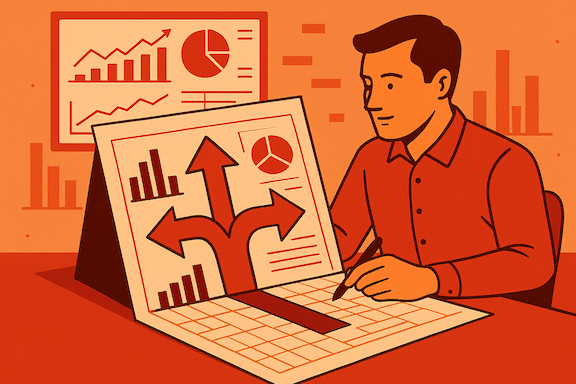
Before diving into whether a course is worth your while, it’s essential to understand why data visualisation and storytelling are important in the first place. Data on its own is often dry, dense, and difficult for most people to interpret. However, when that data is presented visually, it becomes more accessible, understandable, and impactful. Charts, graphs, and other visual tools can highlight trends, patterns, and outliers that might not be immediately apparent in a spreadsheet or a text-based report.
But Data visualisation is more than just creating pretty charts; it’s about transforming complex information into compelling narratives. Whether you’re a business analyst, data scientist, or simply someone who deals with data, mastering data visualisation can be a game-changer. Here’s why:
- Clear Communication: Visualisations help you present your findings clearly. Instead of drowning your audience in spreadsheets and raw numbers, you can create engaging visuals that convey insights effectively.
- Engagement: People are naturally drawn to visual content. Well-designed charts and graphs capture attention and make data more accessible.
- Decision-Making: Visualisations aid decision-making. When you can see trends, outliers, and patterns, you’re better equipped to make informed choices.
Storytelling, on the other hand, allows you to put that data into context. It’s about framing the data in a way that resonates with your audience, making it easier for them to grasp the significance of the information. A well-told story can make the difference between data that informs and data that inspires action. Data storytelling takes visualisation a step further. It’s about weaving a narrative around your data, making it relatable and memorable. Given this, the ability to visualise data and weave it into a compelling story is increasingly seen as an essential skill in many professions. So, if you find yourself needing to communicate data regularly, a course on data visualisation and storytelling could be a valuable investment.
Here’s why data storytelling matters:
- Context: Data alone lacks context. By telling a story, you provide the “why” behind the numbers. Stakeholders can understand not just what happened but also why it matters.
- Emotion: Stories evoke emotions. When you connect data to real-world scenarios, it resonates with your audience. Emotional engagement leads to better retention.
- Influence: Want to convince others? A well-crafted data story can sway opinions, drive action, and influence decision-makers.
Interested in refining your data storytelling techniques? Reach out to us for personalised guidance from experienced professionals.
What a Data Visualisation and Storytelling Course Typically Covers
If you’re considering taking a course, it’s helpful to know what you can expect to learn. Most courses will cover several key areas:
- Fundamentals of data visualisation: This typically includes an introduction to the different types of charts and graphs, when to use them, and the principles of effective visual design. You’ll learn about things like colour theory, typography, and how to use white space to make your visualisations clearer and more engaging.
- Data analysis basics: Some courses may also touch on the basics of data analysis, teaching you how to clean, organise, and summarise your data before you start visualising it. This ensures that the data you’re working with is accurate and reliable.
- Software tools: There’s a wide range of software available for creating data visualisations, from simple tools like Excel to more advanced platforms like Tableau or Power BI. A course will often introduce you to some of these tools and provide hands-on experience using them.
- Storytelling techniques: Beyond the visuals, you’ll learn how to craft a story around your data. This could involve understanding your audience, choosing the right data points to highlight, and structuring your presentation in a way that’s logical and persuasive.
- Ethics and best practices: Finally, many courses will cover the ethics of data visualisation. This includes how to avoid misleading your audience, how to ensure your visualisations are accessible to everyone, and how to respect privacy when working with sensitive data.
The Benefits of A Data Visualisation and Storytelling Course
Now that you know what a course might cover, let’s consider the benefits.
- Developing a valuable skill set: As mentioned earlier, the ability to communicate data effectively is becoming increasingly important in a wide range of fields. Whether you’re in marketing, finance, education, or another industry, being able to present data clearly can set you apart from your peers.
- Improving your presentations: If you often present data to colleagues, clients, or stakeholders, a course can help you make those presentations more engaging and easier to understand. This could lead to better outcomes, whether that’s getting buy-in for a new project, convincing a client to sign on, or helping your team make better decisions.
- Saving time: A course can teach you how to create effective visualisations more quickly and efficiently. Instead of spending hours trying to figure out the best way to present your data, you’ll have a toolbox of techniques and best practices to draw on.
- Staying up-to-date: Data visualisation is a rapidly evolving field, with new tools and techniques emerging all the time. Taking a course can help you stay current with the latest trends and best practices, ensuring that your skills remain relevant.
- Networking opportunities: Courses often provide a chance to connect with others who share your interest in data visualisation. This could lead to valuable professional connections, collaborations, or simply the chance to share ideas and learn from others’ experiences.
Considerations Before Enrolling in a Data Visualisation and Storytelling Course
While there are many potential benefits to taking a course, it’s also important to consider whether it’s the right choice for you. Here are a few factors to think about:
- Your current skill level: If you’re already comfortable with data visualisation and storytelling, you might not need a beginner-level course. However, if you’re new to these concepts, or if you’ve been self-taught and want to formalise your knowledge, a course could be very helpful.
- Your learning style: Some people prefer to learn through structured courses, with a clear syllabus, deadlines, and feedback from instructors. Others might prefer to learn on their own, using books, online tutorials, or by experimenting with data on their own. Think about how you learn best, and whether a formal course fits with that style.
- Time and cost: Courses can vary widely in terms of time commitment and cost. Some are intensive, requiring several hours of study each week for several months. Others might be shorter, more focused workshops. Consider how much time you have available, and whether the cost of the course fits within your budget.
- Your goals: What do you hope to achieve by taking a course? If your goal is to improve your presentations at work, a course could be a good investment. But if you’re just looking to learn for fun, or if you only need to create data visualisations occasionally, you might be better off with a less formal learning approach.
Get hands-on experience: Ready to take your data visualisation skills to the next level?
Choosing the Right Data Visualisation and Storytelling Course
Now that we’ve established the importance of data visualisation and storytelling, how do you choose the right course? Here are some considerations:
- Content: Look for courses that cover both theory and practical application. You want to learn not only the principles but also how to apply them in real-life scenarios.
- Instructors: Who teaches the course matters. Seek instructors with expertise in data visualisation, storytelling, and relevant fields (such as journalism or business).
- Hands-On Practice: Theory is essential, but hands-on practice is where you truly learn. Find courses that offer interactive exercises and assignments.
Data Visualisation and Storytelling CourseRecommendations
Here are a few courses worth exploring:
- The Economist’s Data Storytelling and Visualisation Course: Developed by senior data journalists, this two-week online course teaches you how to spot stories in data, create effective infographics, and avoid common pitfalls.
- Udemy’s “Mastering Data Visualisation: Theory and Foundations”: Suitable for beginners and professionals alike, this course covers essential skills for presenting data convincingly.
- LinkedIn’s course “Data Visualisation and Storytelling Mastery”: Covers techniques for creating compelling narratives using data. It delves into data visualisation skills, including effective graph creation and formatting, using tools like Tableau and Python.
What Are Good Alternatives to A Data Visualisation and Storytelling Course?
If you decide that a formal course isn’t the right choice for you, there are plenty of other ways to improve your data visualisation and storytelling skills.
- Books: There are many excellent books on data visualisation and storytelling, covering everything from the basics to more advanced techniques. Some popular titles include Storytelling with Data by Cole Nussbaumer Knaflic, The Visual Display of Quantitative Information by Edward Tufte, and Information Dashboard Design by Stephen Few.
- Online tutorials: Many websites offer free or low-cost tutorials on data visualisation and storytelling. Sites like Coursera, Udemy, and LinkedIn Learning have courses on specific tools like Tableau or Power BI, as well as more general courses on data visualisation principles.
- Practice: One of the best ways to improve your skills is simply to practice. Start by working with data sets you’re familiar with, and experiment with different ways of visualising the data. Ask for feedback from colleagues or friends and try to learn from your mistakes.
- Learn hands-on with the help of experts. Contact us at Albatrosa. We’ll work on your project together and make sure we share knowledge along the way to empower you to take your data analytics and storytelling further without always having to get back to us.
- Community involvement: Joining online communities or attending meetups related to data visualisation can also be a great way to learn. You can see what others are doing, ask questions, and share your work for feedback.
Conclusion
Remember, investing in your data communication skills pays off. Whether you’re a data professional or someone who wants to make better decisions, a data visualisation and storytelling course can be an asset.
If you want hands-on experience with advanced visualisation tools, get in touch to schedule a session with our specialists.

